Wrapping my head around circular means
For my first long-form blogpost, I thought I’d share a recent statistical problem I’ve had as part of my Masters work.
One of my chapters is about comparing patterns of growth and flowering phenology (the timing of these sorts of events during the year) across a few dozen species of sedge (Cyperaceae)—gramminoid plants common here in the fynbos of the Cape Floristic Region.
For one analysis, I am comparing flowering data between six clades. The biological details are not the focus of this post. I am more interested (for the moment) in sharing the analytical approach I’ve learnt.
Normally in ecology and related disciplines, when we wish to compare two or more distributions of values, we would employ a (t)-test or ANOVA. This is all very well if the values we wish to compare fall on a number line.
This is not the case with phenological or seasonal data.
A small introduction to circular data
A variable describing the time of year, time of day or season of an event is an example of circular data. A simple example of could involve one trying to estimate when, on average, people sleep:
# Make up some data
sleeping <- c(
  24, 23, 24, 23, 22, 24, 23, 21, 22, 24, 23, 20, 22, 23, 24, 24,
  1, 2, 2, 1, 3, 2, 2, 1, 1, 3, 4, 2, 3, 3, 4, 5, 5, 6, 3, 1, 1
)
# Plot its distribution
hist(sleeping,
  breaks = 24,
  xlab   = "Time of day (hour)", ylab = "No. people sleeping",
  main   = ""
)
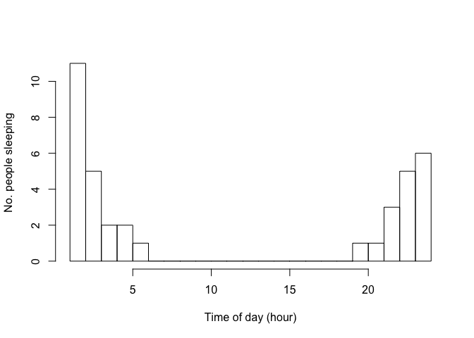
From this made-up data it is clear that people sleep at night. But our go-to statistic, the mean, fails at describing this:
mean(sleeping)
## [1] 11.37838
Nobody was asleep at 11h30 in the afternoon! This statistic is not very helpful. How can we better describe the average time of asleepness?
Part of this issue is that time-of-day is not a linear measurement,
but a circular one. It does not fall on a number line, as 24h00 is the
same “thing” as 00h00. Our sleeping data would be better visualised as
follows (using the R-package
ggplot2) (Wickham 2009):
library(ggplot2)
# Set theme to something simpler, cleaner
theme_set(theme_minimal() + theme(panel.grid.minor = element_blank()))
ggplot(as.data.frame(sleeping), aes(sleeping)) +
  geom_histogram(bins = 24) +  # because 24hrs in a day
  scale_x_continuous(
    breaks = seq(0, 24, 2),
    labels = paste0(seq(0, 24, 2), "h00")  # 01h00, 02h00 etc.
  ) +
  # Make the plot circular
  coord_polar() +
  theme(
    axis.title.x = element_blank(),
    # Remove non-sensical y-axis details now that plot is circular
    axis.title.y = element_blank(),
    axis.text.y  = element_blank()
  )
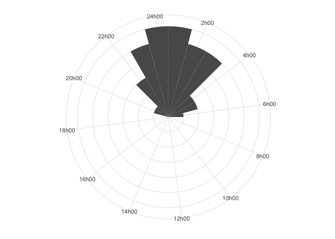
Here, it is much clearer that people tend to be asleep around 00h00 to
01h00. The R-package
circular
(Agostinelli and Lund 2017) provides an interface to this common form of
data in the social sciences and ecology. It enables us to calculate
statistics such as the circular mean, which accounts for the fact that
our data live on a circle and not a number line.
To convert data into explicitly circular data, we use
circular::as.circular(), which takes a vector as input:
library(circular)
##
## Attaching package: 'circular'

## The following objects are masked from 'package:stats':
##
##     sd, var
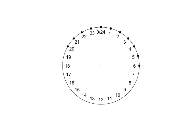
sleeping <- as.circular(sleeping,
  type     = "directions",
  units    = "hours",
  template = "clock24"
)
sleeping
plot(sleeping)
## Circular Data:
## Type = directions
## Units = hours
## Template = clock24
## Modulo = asis
## Zero = 1.570796
## Rotation = clock
##  [1] 24 23 24 23 22 24 23 21 22 24 23 20 22 23 24 24  1  2  2  1  3  2  2
## [24]  1  1  3  4  2  3  3  4  5  5  6  3  1  1
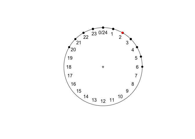
Now, the mean makes much more sense:
mean(sleeping)
plot(sleeping)
points(mean(sleeping), col = "red")
## Circular Data:
## Type = directions
## Units = hours
## Template = clock24
## Modulo = asis
## Zero = 1.570796
## Rotation = clock
## [1] 1.975252
My data: flowering times in Cape sedges
I began this post by saying that I wanted to share the application of circular statistics to some data for my Masters (albeit a small example thereof).
As above, I am comparing flowering data between six clades of gramminoid fynbos plants (Cyperaceae, Tribe Schoeneae), namely the genera Schoenus L. and Tetraria Beauv. Tetraria is known to be polyphyletic, and until recently the only Schoenus species in southern Africa was the cosmopolitain S. nigricans L. The rest, used below, have been transferred from Tetraria Beauv. to Schoenus L. by Elliott and Muasya (2017).
The last large-scale conspectus of the Cape flora was by Manning and Goldblatt (2012). The flowering data I use here are from that flora, with species names ammended to match then current taxonomy (as in Elliott and Muasya 2017). Each species has flowering times as follows:
| Species | Start | End |
|---|---|---|
| Schoenus adnatus | Feb | Aug |
| Schoenus complanatus | Dec | Mar |
| Schoenus dregeanus | Dec | Apr |
| Schoenus gracilimus | Dec | Mar |
| Schoenus lucidus | Dec | Dec |
| Schoenus quadrangularis | Nov | May |
| Schoenus neovillosus | Jan | Feb |
| Schoenus arenicola | Jul | Nov |
| Schoenus compar | Apr | Jun |
| Schoenus pictus | Dec | May |
| Schoenus bolussi | Jul | Aug |
| Schoenus compactus | Aug | Nov |
| Schoenus crassus | Apr | Jun |
| Schoenus cuspidatus | Aug | Nov |
| Schoenus exilis | Apr | Jun |
| Schoenus graminifolius | Jul | Nov |
| Schoenus laticulmis | May | Dec |
| Schoenus variabilis | Apr | June |
| Tetraria capillacea | Oct | Nov |
| Tetraria crinifolia | Aug | Oct |
| Tetraria fasciata | Nov | May |
| Tetraria ferruginea | Mar | Jul |
| Tetraria flexuosa | Jan | May |
| Tetraria fourcadei | Jan | May |
| Tetraria maculata | Dec | Feb |
| Tetraria ustulata | Jan | May |
| Tetraria cernua | Oct | Nov |
| Tetraria burmanii | Nov | Apr |
| Tetraria fimbriolata | Jan | Apr |
| Tetraria microstachys | Dec | Feb |
| Tetraria nigrovaginata | Jan | Apr |
| Tetraria pillansii | Jan | Feb |
| Tetraria pubescens | Oct | Apr |
| Tetraria pygmaea | Feb | Apr |
| Tetraria vaginata | Sep | Apr |
| Tetraria bromoides | Oct | Feb |
| Tetraria eximia | May | Aug |
| Tetraria involucrata | Jan | Apr |
| Tetraria robusta | Feb | Mar |
| Tetraria secans | Apr | May |
| Tetraria thermalis | Jun | Oct |
| Tetraria triangularis | Feb | Apr |
Flowering times (start and end) for Schoenus L. and Tetraria Beauv. (Cyperaceae, Tribe Schoeneae), from Manning and Goldblatt (2012).
Along with these data, taxonomic research groups these species into three clades in each genus (Schoenus and Tetraria). That merely explain the colour-coding used in the figures below.
For now, let’s unpack how to take "Jan", "Feb", "Mar" and turn it
into meaningful numerical data, and treat that data circularly such that
December and January are adjecent.
Flowering months as numerical data
First, we need to convert the monthly abbreviations into numbers. Simple
enough: "Jan" = 1, "Feb" = 2, etc. I apply this process for each
rows’ flowering_start and flowering_end values, row-by-row, using
purrr–a functional programming package for R.
get_month_int <- function(month_abb) {
  # Converts "Jan", "Feb", etc. -> 1, 2, etc.
  month_abb %>%
    map_int(~ ifelse(.x %in% month.abb,
      which(month.abb == .x),
      NA
    ))
}
# Apply get_month_int() to the data
flowering_times <- flowering_times %>%
  mutate(
    flowering_start = get_month_int(flowering_start),
    flowering_end   = get_month_int(flowering_end)
  )
flowering_times
## # A tibble: 42 x 4
##    clade               species                flowering_start flowering_end
##    <chr>               <chr>                            <int>         <int>
##  1 Epischoenus spp.    Schoenus adnatus                     2             8
##  2 Epischoenus spp.    Schoenus complanatus                12             3
##  3 Epischoenus spp.    Schoenus dregeanus                  12             4
##  4 Epischoenus spp.    Schoenus gracilimus                 12             3
##  5 Epischoenus spp.    Schoenus lucidus                    12            12
##  6 Epischoenus spp.    Schoenus quadrangular…              11             5
##  7 Epischoenus spp.    Schoenus neovillosus                 1             2
##  8 S. compar-S. pictus Schoenus arenicola                   7            11
##  9 S. compar-S. pictus Schoenus compar                      4             6
## 10 S. compar-S. pictus Schoenus pictus                     12             5
## # … with 32 more rows
Now, let’s create sequences of months that a species is in flower for,
starting at flowering_start, ending at flowering_end. This will be
embedded within the dataframe as a list-column–where each entry in
the column is itself a list, nested in the dataframe. I apply this
process for each pair of flowering_start-flowering_end values,
again, using purrr–a functional programming package for R.
get_month_seq <- function(start, end) {
  # Creates seq from start to end, unless end <= start
  # (e.g. Nov:Feb = 11, 12, 1, 2)
  map2(start, end, function(start, end) {
    month_seq <-
      if (any(is.na(c(start, end)))) NA
      else if (start > end)          c(start:12, 1:end)
      else if (start <= end)         start:end
    month_seq
  })
}
flowering_times <- flowering_times %>%
  mutate(flowering_months = get_month_seq(flowering_start, flowering_end))
flowering_times
## # A tibble: 42 x 5
##    clade       species       flowering_start flowering_end flowering_months
##    <chr>       <chr>                   <int>         <int> <list>
##  1 Epischoenu… Schoenus adn…               2             8 <int [7]>
##  2 Epischoenu… Schoenus com…              12             3 <int [4]>
##  3 Epischoenu… Schoenus dre…              12             4 <int [5]>
##  4 Epischoenu… Schoenus gra…              12             3 <int [4]>
##  5 Epischoenu… Schoenus luc…              12            12 <int [1]>
##  6 Epischoenu… Schoenus qua…              11             5 <int [7]>
##  7 Epischoenu… Schoenus neo…               1             2 <int [2]>
##  8 S. compar-… Schoenus are…               7            11 <int [5]>
##  9 S. compar-… Schoenus com…               4             6 <int [3]>
## 10 S. compar-… Schoenus pic…              12             5 <int [6]>
## # … with 32 more rows
Lastly, we just need to reshape this data into a form ggplot2 can
understand: long-form data.
flowering_times <- flowering_times %>%
  unnest() %>% # unnest the list-columns so ggplot can understand
  # Arrange species by sub-generic clade
  arrange(clade) %>%
  mutate(species = factor(species, levels = unique(species)))
flowering_times
## # A tibble: 173 x 5
##    clade       species       flowering_start flowering_end flowering_months
##    <chr>       <fct>                   <int>         <int>            <int>
##  1 Epischoenu… Schoenus adn…               2             8                2
##  2 Epischoenu… Schoenus adn…               2             8                3
##  3 Epischoenu… Schoenus adn…               2             8                4
##  4 Epischoenu… Schoenus adn…               2             8                5
##  5 Epischoenu… Schoenus adn…               2             8                6
##  6 Epischoenu… Schoenus adn…               2             8                7
##  7 Epischoenu… Schoenus adn…               2             8                8
##  8 Epischoenu… Schoenus com…              12             3               12
##  9 Epischoenu… Schoenus com…              12             3                1
## 10 Epischoenu… Schoenus com…              12             3                2
## # … with 163 more rows
Plotting flowering times
Now we can really plot this data:
flowering_plot <-
  ggplot(flowering_times, aes(flowering_months, species, fill = clade)) +
    geom_tile() +
    scale_x_continuous(breaks = 1:12, labels = month.abb) +
    theme(
      axis.title.x = element_blank(),  # no need for x-axis title
      axis.text.y  = element_text(hjust = 0)  # left-justify species names
    )
flowering_plot
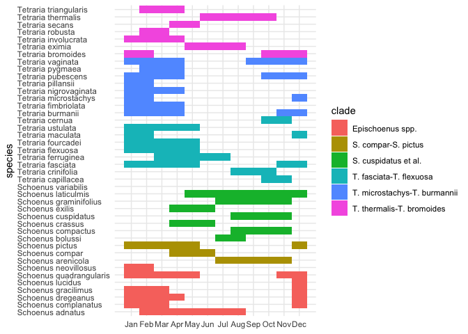
It’s clear that all the (austral) summer flowering species
("Dec"–"Feb") could really benefit from a circular plot. Thus:
flowering_plot +
  # Make the plot circular
  coord_polar() +
  # Remove non-sensical y-axis details now that plot is circular
  theme(
    axis.text.y  = element_blank(),
    axis.title.y = element_blank()
  )
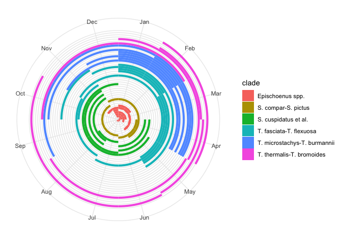
This is much more realistic. Problem is, it squashes up all the species in the centre of the circle.
Perhaps a better summary would be a count of the number of species in flower in a given month, for each clade. Like so:
flowering_plot2 <-
  ggplot(flowering_times, aes(flowering_months, fill = clade)) +
    geom_bar() +
    scale_x_continuous(breaks = 1:12, labels = month.abb) +
    coord_polar() +
    facet_wrap(~clade) +
    theme(
      axis.title.x    = element_blank(),
      axis.text.y     = element_blank(),
      axis.title.y    = element_blank(),
      strip.text      = element_blank()  # legend duplicates facet labels
    )
flowering_plot2
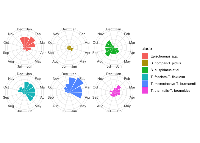
Now that we’ve figured out how to plot the data in some useful ways, let’s now try and analyses with the appropriate statistics.
Statistics for flowering times
First, let’s just simplify the dataset for the purposes of this exercise. I’m going to just group months where any species is in flower, grouped by clade:
flowering_summary <- flowering_times %>%
  select(clade, flowering_months) %>%
  # Split the dataframe into a list according to clade
  split(.$clade) %>%
  # For each item in the list, return only the vector of flowering months
  map(pull, flowering_months) %>%
  # Tidy up the list's names
  {set_names(., names(.) %>%
    # Replace hyphens ("-") & spaces (" ") with underscores ("_")
    str_replace_all("[-\ ]", "_") %>%
    # Remove fullstops (".")
    str_remove_all("\\.")
  )}
flowering_summary
## $Epischoenus_spp
##  [1]  2  3  4  5  6  7  8 12  1  2  3 12  1  2  3  4 12  1  2  3 12 11 12
## [24]  1  2  3  4  5  1  2
##
## $S_compar_S_pictus
##  [1]  7  8  9 10 11  4  5  6 12  1  2  3  4  5
##
## $S_cuspidatus_et_al
##  [1]  7  8  8  9 10 11  4  5  6  8  9 10 11  4  5  6  7  8  9 10 11  5  6
## [24]  7  8  9 10 11 12 NA
##
## $T_fasciata_T_flexuosa
##  [1] 10 11  8  9 10 11 12  1  2  3  4  5  3  4  5  6  7  1  2  3  4  5  1
## [24]  2  3  4  5 12  1  2  1  2  3  4  5 10 11
##
## $T_microstachys_T_burmannii
##  [1] 11 12  1  2  3  4  1  2  3  4 12  1  2  1  2  3  4  1  2 10 11 12  1
## [24]  2  3  4  2  3  4  9 10 11 12  1  2  3  4
##
## $T_thermalis_T_bromoides
##  [1] 10 11 12  1  2  5  6  7  8  1  2  3  4  2  3  4  5  6  7  8  9 10  2
## [24]  3  4
Now let’s circular::-ise and mean the data (I also use the package
astroFns (Harris 2012) to help convert my data into radians, which
seems to be the simplest way to work with circular data):
library(tidyverse)
library(magrittr)  # ::divide_by()
##
## Attaching package: 'magrittr'

## The following object is masked from 'package:purrr':
##
##     set_names

## The following object is masked from 'package:tidyr':
##
##     extract
library(circular)
library(astroFns)  # ::hms2rad()

month2rad <- function(month) {
  stopifnot(month %in% 1:12)
  hms2rad(2 * month)  # use 24hr time as astroFns:: does
}
rad2month <- function(radian) {
  radian %>%
    rad2hms() %>%
    substr(1, 2) %>%  # b/c astroFns:: returns an hms string
    as.numeric() %>%
    divide_by(2)
}
my_circular_mean <- function(x) {
  x %>%
    month2rad() %>%
    circular(rotation = "clock", template = "geographics") %>%
    mean() %>%
    rad2month()
}
flowering_circular_means <- flowering_summary %>%
  map(~.x[!is.na(.x)]) %>%  # FIXME/TODO: track down this NA for my MSc...
  map(my_circular_mean)
flowering_circular_means
## $Epischoenus_spp
## [1] 2
##
## $S_compar_S_pictus
## [1] 4.5
##
## $S_cuspidatus_et_al
## [1] 8
##
## $T_fasciata_T_flexuosa
## [1] 2
##
## $T_microstachys_T_burmannii
## [1] 1.5
##
## $T_thermalis_T_bromoides
## [1] 3.5
Let’s add these to our plot:
# Put the means in a data.frame so ggplot2 can understand
mean_flowering_times <- flowering_circular_means %>%
  imap_dfr(~tibble(clade = .y, mean_flowering_time = .x)) %>%
  arrange(clade) %>%
  mutate(clade = unique(sort(flowering_times$clade)))
flowering_plot2 +
  geom_vline(data = mean_flowering_times, aes(xintercept = mean_flowering_time))
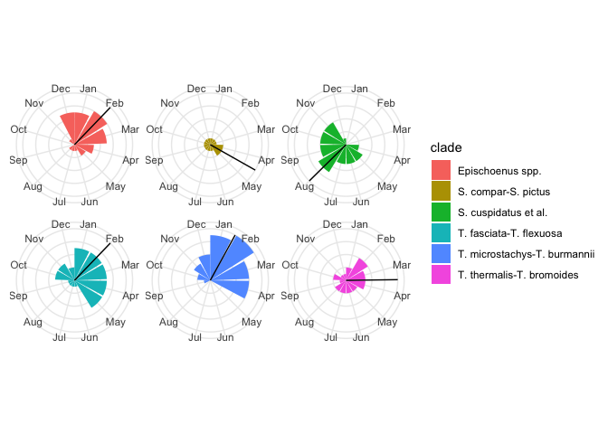
Those means seem to make sense—they are at the intuitive centre of each clade’s flowering distribution! Hooray!
Session info
I present here my machine’s state at time of writing, for reproducibility’s sake.
sessionInfo()
## R version 3.5.0 (2018-04-23)
## Platform: x86_64-apple-darwin15.6.0 (64-bit)
## Running under: macOS  10.14.5
##
## Matrix products: default
## BLAS: /Library/Frameworks/R.framework/Versions/3.5/Resources/lib/libRblas.0.dylib
## LAPACK: /Library/Frameworks/R.framework/Versions/3.5/Resources/lib/libRlapack.dylib
##
## locale:
## [1] en_US.UTF-8/en_US.UTF-8/en_US.UTF-8/C/en_US.UTF-8/en_US.UTF-8
##
## attached base packages:
## [1] stats     graphics  grDevices utils     datasets  methods   base
##
## other attached packages:
##  [1] astroFns_4.1-0  magrittr_1.5    forcats_0.4.0   stringr_1.4.0
##  [5] dplyr_0.8.0.1   purrr_0.3.2     readr_1.3.1     tidyr_0.8.3
##  [9] tibble_2.1.1    tidyverse_1.2.1 here_0.1        circular_0.4-93
## [13] ggplot2_3.1.1
##
## loaded via a namespace (and not attached):
##  [1] tidyselect_0.2.5 xfun_0.6         haven_2.1.0      lattice_0.20-38
##  [5] vctrs_0.1.0      colorspace_1.4-1 generics_0.0.2   htmltools_0.3.6
##  [9] yaml_2.2.0       utf8_1.1.4       rlang_0.3.4      pillar_1.4.0
## [13] glue_1.3.1       withr_2.1.2      modelr_0.1.4     readxl_1.3.1
## [17] plyr_1.8.4       munsell_0.5.0    gtable_0.3.0     cellranger_1.1.0
## [21] rvest_0.3.3      mvtnorm_1.0-10   evaluate_0.13    labeling_0.3
## [25] knitr_1.22       fansi_0.4.0      highr_0.8        broom_0.5.2
## [29] Rcpp_1.0.1       scales_1.0.0     backports_1.1.4  jsonlite_1.6
## [33] hms_0.4.2        digest_0.6.19    stringi_1.4.3    grid_3.5.0
## [37] rprojroot_1.3-2  cli_1.1.0        tools_3.5.0      lazyeval_0.2.2
## [41] zeallot_0.1.0    crayon_1.3.4     pkgconfig_2.0.2  xml2_1.2.0
## [45] lubridate_1.7.4  rstudioapi_0.10  assertthat_0.2.1 rmarkdown_1.12
## [49] httr_1.4.0       R6_2.4.0         boot_1.3-22      nlme_3.1-137
## [53] compiler_3.5.0
References
Agostinelli, C., and U. Lund. 2017. R Package circular: Circular
Statistics (Version 0.4-93). CA: Department of Environmental Sciences,
Informatics; Statistics, Ca’ Foscari University, Venice, Italy. UL:
Department of Statistics, California Polytechnic State University, San
Luis Obispo, California, USA.
https://r-forge.r-project.org/projects/circular/.
Elliott, T.L., and A.M. Muasya. 2017. “Taxonomic Realignment in the Southern African Tetraria (Cyperaceae, Tribe Schoeneae; Schoenus Clade).” South African Journal of Botany 112: 354–60. https://doi.org/https://doi.org/10.1016/j.sajb.2017.06.011.
Harris, Andrew. 2012. AstroFns: Astronomy: Time and Position Functions, Misc. Utilities. https://CRAN.R-project.org/package=astroFns.
Manning, John, and Peter Goldblatt. 2012. Plants of the Greater Cape Floristic Region. 1: The Core Cape Flora. South African National Biodiversity Institute.
Wickham, Hadley. 2009. Ggplot2: Elegant Graphics for Data Analysis. Springer-Verlag New York. http://ggplot2.org.